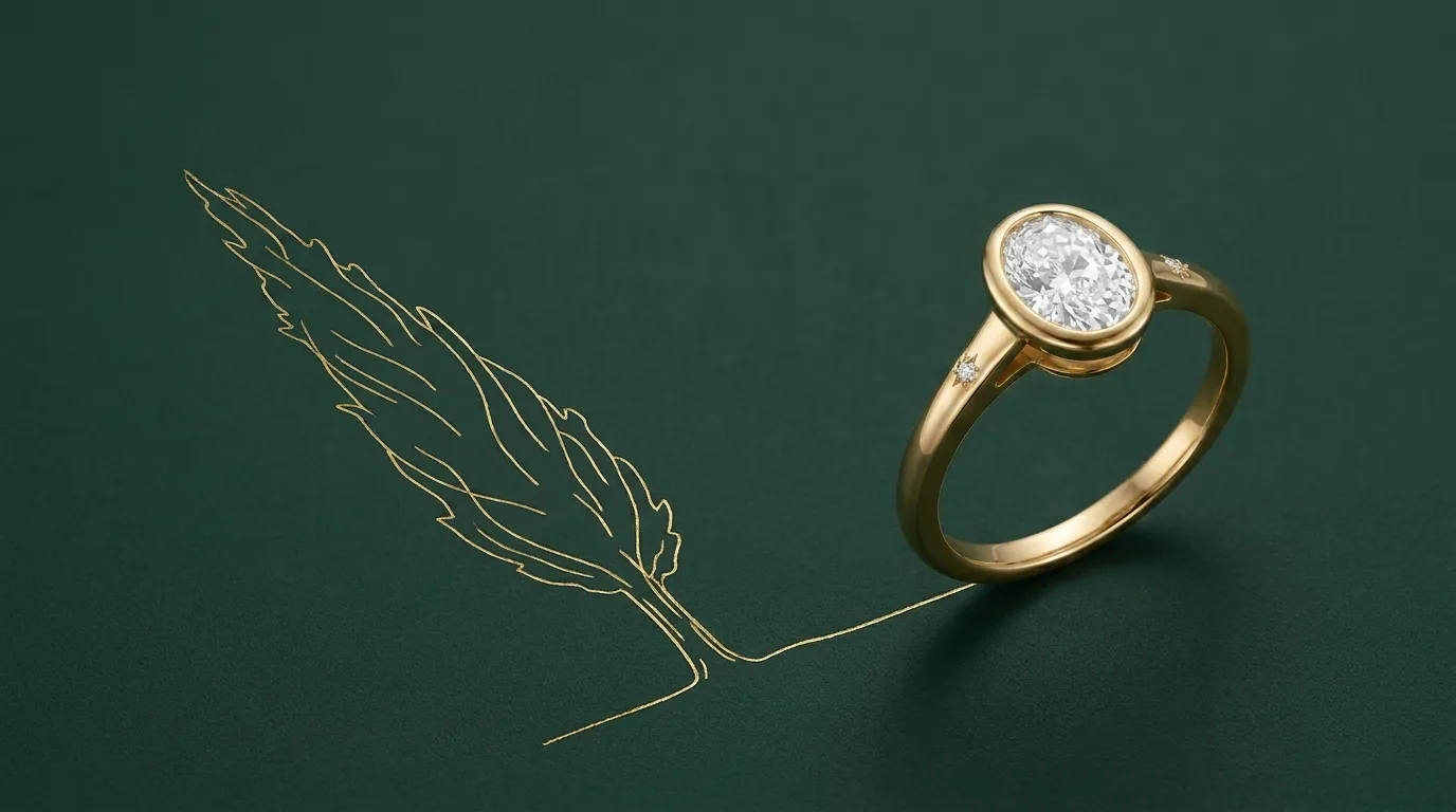
Ask someone which diamond shape looks biggest and they will usually answer with a shape name. The more useful answer starts with a different question: what does “looks biggest” actually mean, and is carat weight really measuring it?

Weight is not what you see
A carat is a unit of mass. One carat is 0.2 grams, full stop, and on its own it says nothing about how large a stone will look once it is set. Weight, in other words, tells you surprisingly little about the actual visual outcome.
Two stones cut to the exact same carat figure can present very differently face-up. Cut too deep, a stone buries a good proportion of its weight low down, out of sight below the girdle, where nobody sees it. Cut well, that same weight shows up where you can actually see it, as visible diameter across the top of the stone. So the useful question is not how many carats a stone weighs. It is what its millimetre measurements are: length and width for anything other than a round shape, diameter for a round brilliant. Carat weight tells you what you are paying for. Millimetres tell you what you will actually see. The two are related, but they are not the same figure, and a jeweller who can quote both without being asked twice has clearly thought about the stone in those terms already.
How shape tends to read on a hand
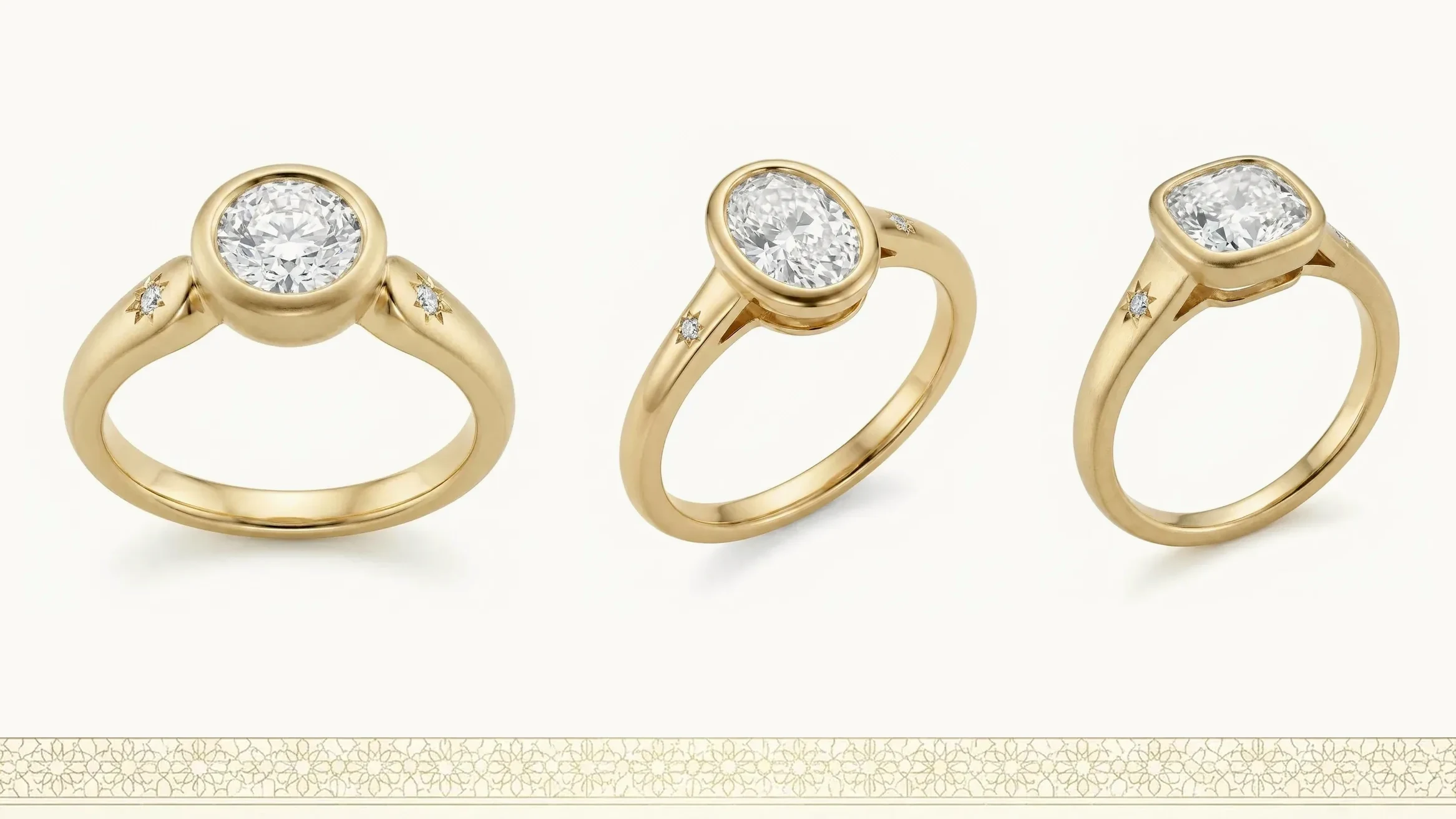
Shape changes how a stone occupies the finger, independent of how much it weighs, and it is worth trying more than one shape before settling on anything from a photograph.
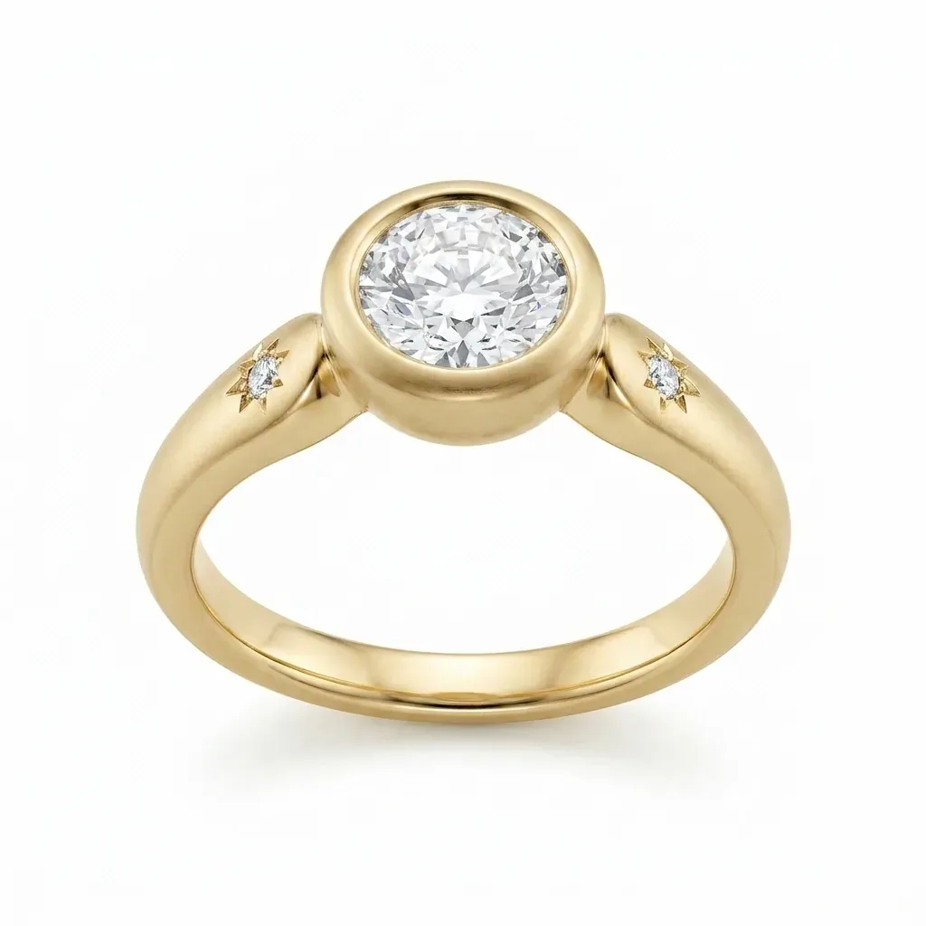
A round brilliant is the same from whichever direction you look at it: no length running one way, no width running another. That symmetry is exactly why it tends to read as neat, contained and instantly familiar, whatever size the stone actually is.
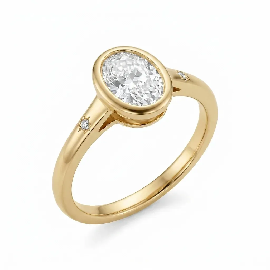
Ovals, marquise, pear and emerald cuts share one trait a round brilliant does not: length. A stone that runs longer than it is wide covers a larger visible area for the same carat weight, which is why an elongated shape often draws the eye further up the finger and can look more substantial face-up than a round stone weighing exactly the same. It is a genuine effect of geometry, not an illusion, and it is one reason two stones of identical weight can leave very different impressions once they are actually worn.
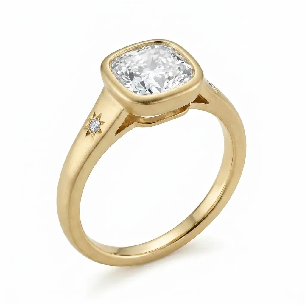
Square and cushion cuts sit between those two tendencies. A square shape, most often cut as a princess, keeps sharp, defined corners and reads as structured and architectural. A cushion softens those same corners into a curve, which tends to feel a little less graphic and, on some hands, a touch warmer. Neither extends up the finger the way a true elongated cut does, but both read fuller than a round stone of equal weight.
None of this is a rule, and nothing here ranks one shape above another. Hand shape, finger length and the width of the band all change how a given shape actually looks once it is on, sometimes considerably. The only genuinely reliable way to know how a shape reads on a particular hand is to try it on that hand, not to judge it from a catalogue photograph shot on somebody else’s.
Aspect ratio, and why there is no correct one
Elongated shapes carry one further figure worth knowing about: aspect ratio, which is simply how the stone’s length compares to its width. A slender, elongated oval or marquise sits at a higher ratio. A shorter, rounder one sits lower, closer to the proportions of a round brilliant.
Nobody can tell you the correct ratio, because there is not one. It comes down entirely to personal taste, and the very same ratio can look quite different once it sits inside a particular setting, next to a particular band width, on a particular hand. A slim oval that looks elegant on one person can look severe on another. A fuller marquise that looks generous on one hand can look unremarkable on another. Treat anyone who hands you a single “ideal” figure with real scepticism. What they are actually offering is a personal preference, dressed up as a specification.
Setting height changes the reading too
The stone is not the only thing deciding how a ring reads. How high the setting lifts a stone off the finger changes the whole shape of the ring in profile, and something that looks perfectly balanced looking straight down at it can sit surprisingly higher, or lower, once it is actually worn. That is its own subject, and it is covered properly in our guide to engagement ring settings: shape decides how a stone occupies the finger from above, setting height decides how it sits once you look from the side, and the two questions are worth answering together rather than separately.
The practical habit worth keeping
Two things do more for this decision than any amount of reading. Try shapes on an actual hand before settling on one from an image, because a catalogue photograph is shot at one angle, in one light, on one particular hand, and none of those three things are yours. And ask for the stone’s measurements in millimetres alongside its carat weight, so the decision is based on what you will actually see rather than a figure that only partly describes it.
The same habit holds whatever period of stone draws you. Older cuts, covered here, were proportioned to entirely different conventions than a modern stone of the same weight, which is one more reason the millimetre figure earns its place next to the carat figure rather than being replaced by it.
There is no shape that suits every hand, and no ratio that suits every taste. What actually helps is seeing the real proportions, on the real hand, before anything is decided. That conversation, alongside the rest of the choices behind a commissioned ring, is one we are glad to have: read more about how a commission works.